
Third design alternative
Future Adriatic, 2026.
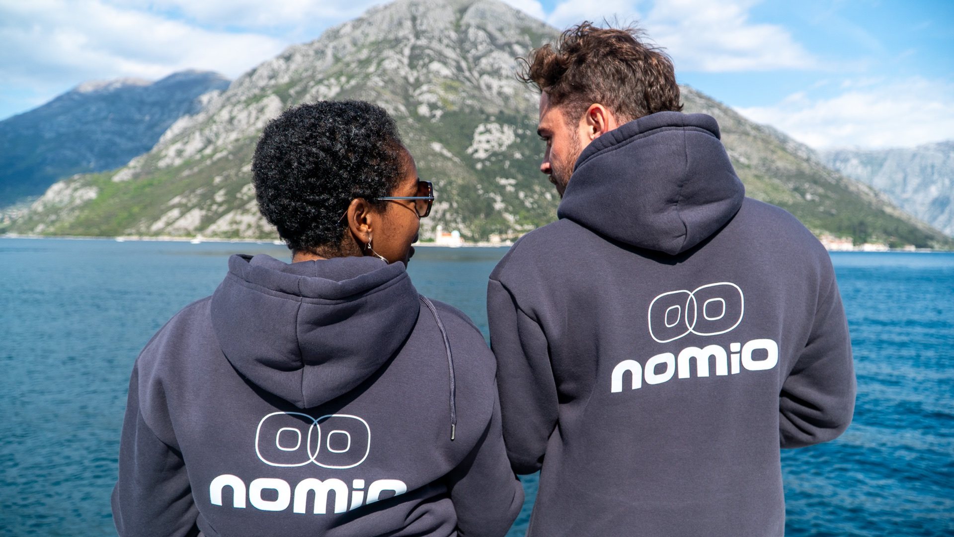
A trend-aware palette that feels brighter and more international while keeping Nomio's real people, Bay setting and working guest journeys at the centre.
Colour system
Calm structure, confident signals.
Cloud white creates space. Teal carries trust and the Adriatic setting. Fuchsia and purple add selective energy around actions, events and editorial details.
What changes
A more current visual pulse.
- Cloud white lightens the main canvas.
- Transformative teal replaces the standard deep sea-green structure.
- Fuchsia and purple sharpen calls to action, event cues and glows.
- Wax and cocoa neutrals keep the brighter palette grounded.
What stays
The same complete Nomio website.
- All public pages, copy, images and booking routes remain unchanged.
- HotelSync, WhatsApp, email and Luma handoffs work exactly as before.
- The responsive layout, typography and accessibility remain intact.
- The standard theme, burgundy comparison and management area are untouched.