
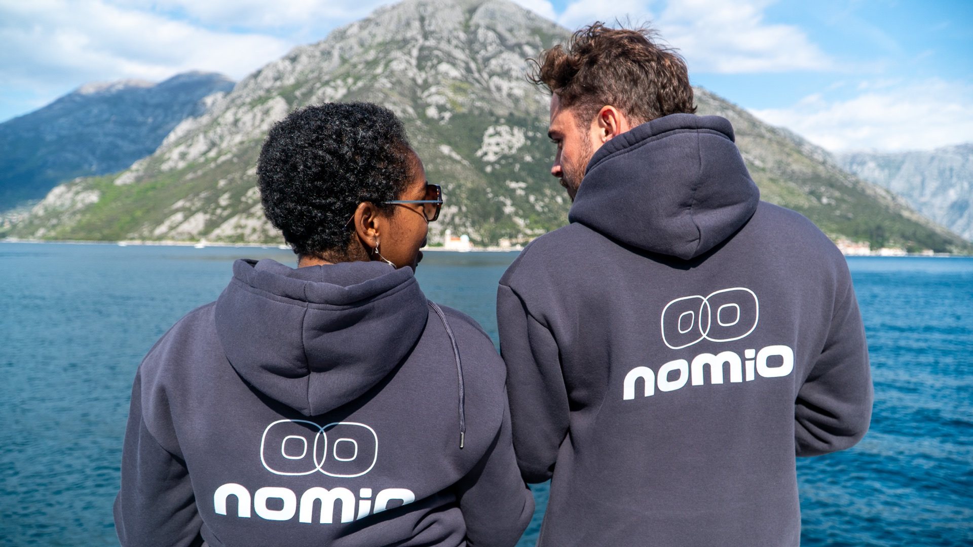
Alternative art direction
Nomio in burgundy.
This comparison keeps every page, booking route and operational handoff unchanged. Only the visual language changes.
Colour system
A sharper, editorial palette.
Burgundy becomes the single expressive accent. Black, white and quiet greys carry the structure so the photography remains central.
What changes
More contrast, less softness.
- Burgundy replaces the warm clay accent.
- Neutral greys replace sea-green secondary surfaces.
- Photo overlays move toward black with a burgundy undertone.
- Buttons, focus states and editorial glows follow the new accent.
What stays
The same working website.
- All public pages, copy and images remain the same.
- HotelSync, WhatsApp, email and Luma routes are unchanged.
- The existing typography, responsive layout and accessibility remain intact.
- The management area is deliberately excluded from the comparison.